Context
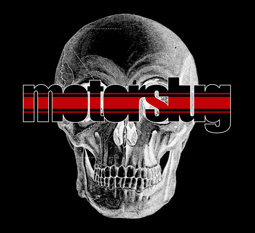
Motorslug is a full-throttle assault of rock guitar with powerful angst-driven vocals. Yet, there is a undertone of self-aware humanism. Those brand values are shown through in-your-face imagery of hot rod culture mixed with punk and metal visual themes. The logotype’s heavy condensed weight with filled-in counter areas relates to the intense impact of the music, while the racing stripe connects to racing and motor sports.
Motorslug is a full-throttle assault of rock guitar with powerful angst-driven vocals. Yet, there is a undertone of self-aware humanism. Those brand values are shown through in-your-face imagery of hot rod culture mixed with punk and metal visual themes. The logotype’s heavy condensed weight with filled-in counter areas relates to the intense impact of the music, while the racing stripe connects to racing and motor sports.
Contributions
I have collaborated with the band through numerous song releases, creating artwork for both CDs as well as on-stage live performances.
I have collaborated with the band through numerous song releases, creating artwork for both CDs as well as on-stage live performances.
Role
Creative Director, Lead Designer, Writer, Front-end Dev
Creative Director, Lead Designer, Writer, Front-end Dev
Software
Photoshop, Illustrator, Dreamweaver, Word, Safari & Chrome Dev Tools
LOGO & BRAND IMAGERY
The brand values are shown through in-your-face imagery of hot rod and motorsport culture combined with punk and metal visual themes. The logotype’s heavy condensed weight with filled-in counter areas relates to the intense impact of the music, while the racing stripe connects to racing and motor sports.
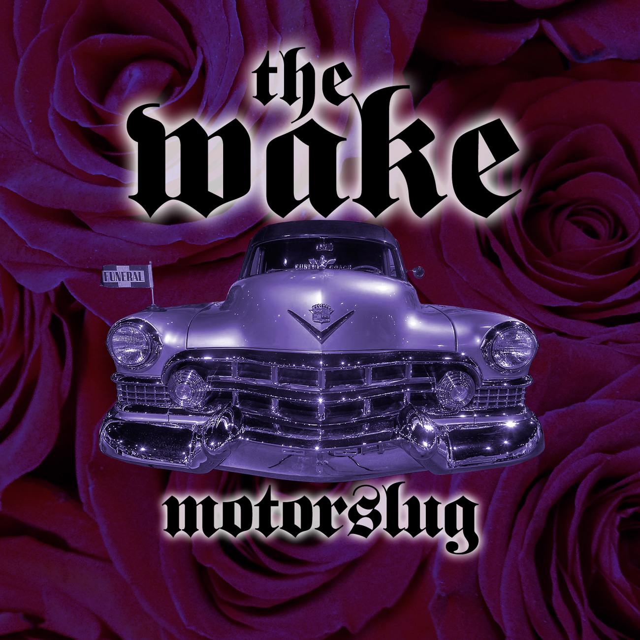
THE WAKE CD COVER
Motorslug wrote the song The Wake in honor of a friend of the band that had passed away after a long illness. While the song references death, the CD single cover artwork also needed to represent the vibrance of the woman’s life and spirit.
This aspect was indicated by a photograph I took of a compact group of roses, which forms a swirling abstract background and a symbol of the energy of her life. The vintage ’50’s Cadillac hearse is in alignment with the band’s aggresive brand shown in previous releases. The Fette Fraktur font provided the weighty density appropriate for a full-throttle rock band.
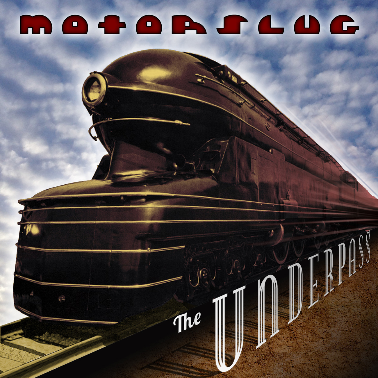
UNDERPASS CD COVER
Motorslug’s Underpass release, a collection of hard rocking songs that featuring some of their best written and produced work, required a fittingly awesome cover design. The kinetic layout featuring an iconic and powerful train image relates to the meaning behind the title song as well as the rumbling energy of their music.
For the band name, I created a custom hand-drawn font that represents a modern take on 1930’s industrialism. The final result, with additional typographic manipulations and surrealist shadows and environmental affectations, is a powerful and memorable design worthy of their great music.