Context
Kurt Ribak is a classically trained and very accomplished bass jazz musician. He writes nearly all his own compositions and leads a three to five piece band.
Kurt Ribak is a classically trained and very accomplished bass jazz musician. He writes nearly all his own compositions and leads a three to five piece band.
Contributions
I have worked closely with Kurt through all of his releases, creating CD packaging, posters, and t-shirt artwork.
I have worked closely with Kurt through all of his releases, creating CD packaging, posters, and t-shirt artwork.
Role
Creative Director, Lead Designer, Writer
Creative Director, Lead Designer, Writer
Software
Photoshop, Illustrator
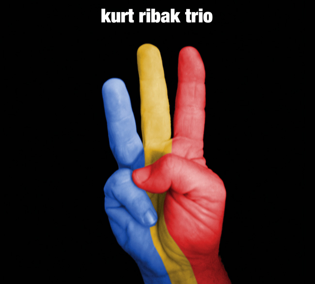
SELF TITLED RELEASE
This self-titled CD is his first release. The three-fingered hand signal was derived through nearly spontaneous concept collaboration. Kurt made the gesture. We both had the “ah-ha!” moment. Then, I suggested the extra twist of the three primal colors, to represent the primal colors of jazz: bass, keyboard, and drums. The simplicity of this three-fingered design has remained as an iconic symbol of his band, throughout Kurt’s career. (People come to his shows wearing the related t-shirt I also designed.)
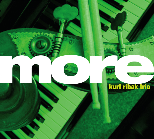
MORE: SECOND CD RELEASE
More is Kurt Ribak’s second release. It is a continuation of the music coming from the recording sessions of Kurt’s first release. The detail photographs of the instruments emphasizes the core team of bass, keyboard, and drums, while the plush doll image of the poster and the frothy treatment of typography relate to the playful tongue-in-cheek nature of much of Kurt’s music: informed artfulness.
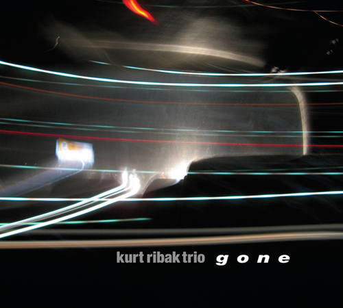
GONE: THIRD CD RELEASE
The overall conceptual reference of Gone, Kurt’s third release, is derived from the idea of transition, both in musical evolution and with the untimely death of Kurt’s father. These unavoidable forces are defined visually as fluid and erratic trails of light, in a nod to the “highway of life.” The overall darkness of the imagery subtly conveys the notion of loss and the search for new ways of life passage, while the energy and complexity of the light trails relate to the interconnected rhythms and melodies of jazz.